Design Work

Context
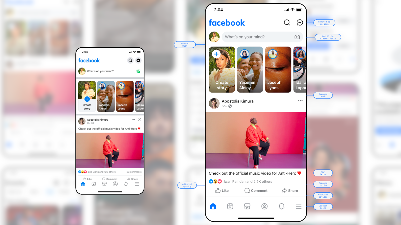
As Facebook evolved to support how people discover content and connect at scale, its visual foundation needed to evolve with it. Over time, brand and UI patterns had become fragmented and no longer met the bar for clarity, accessibility, or consistency.
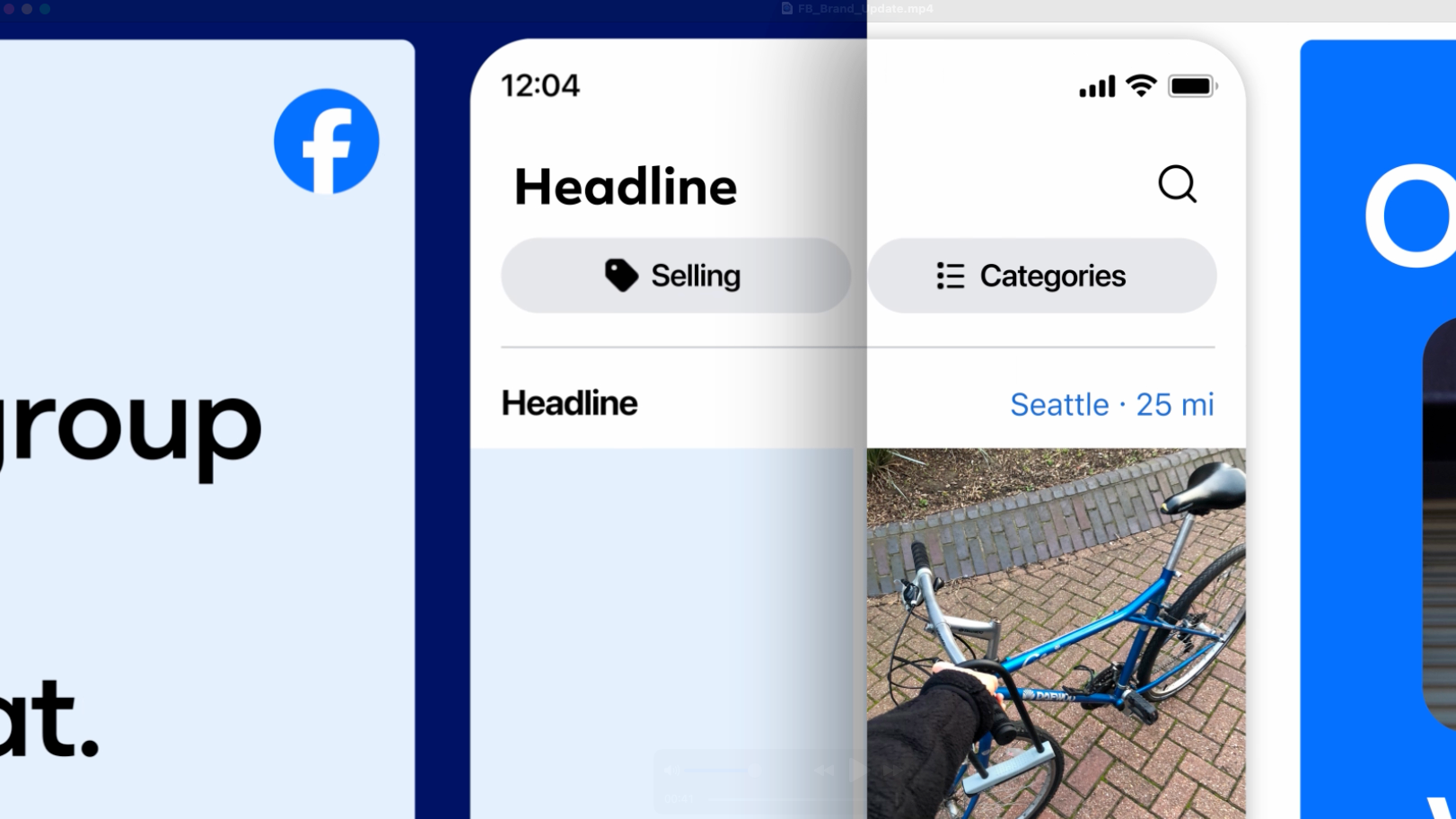
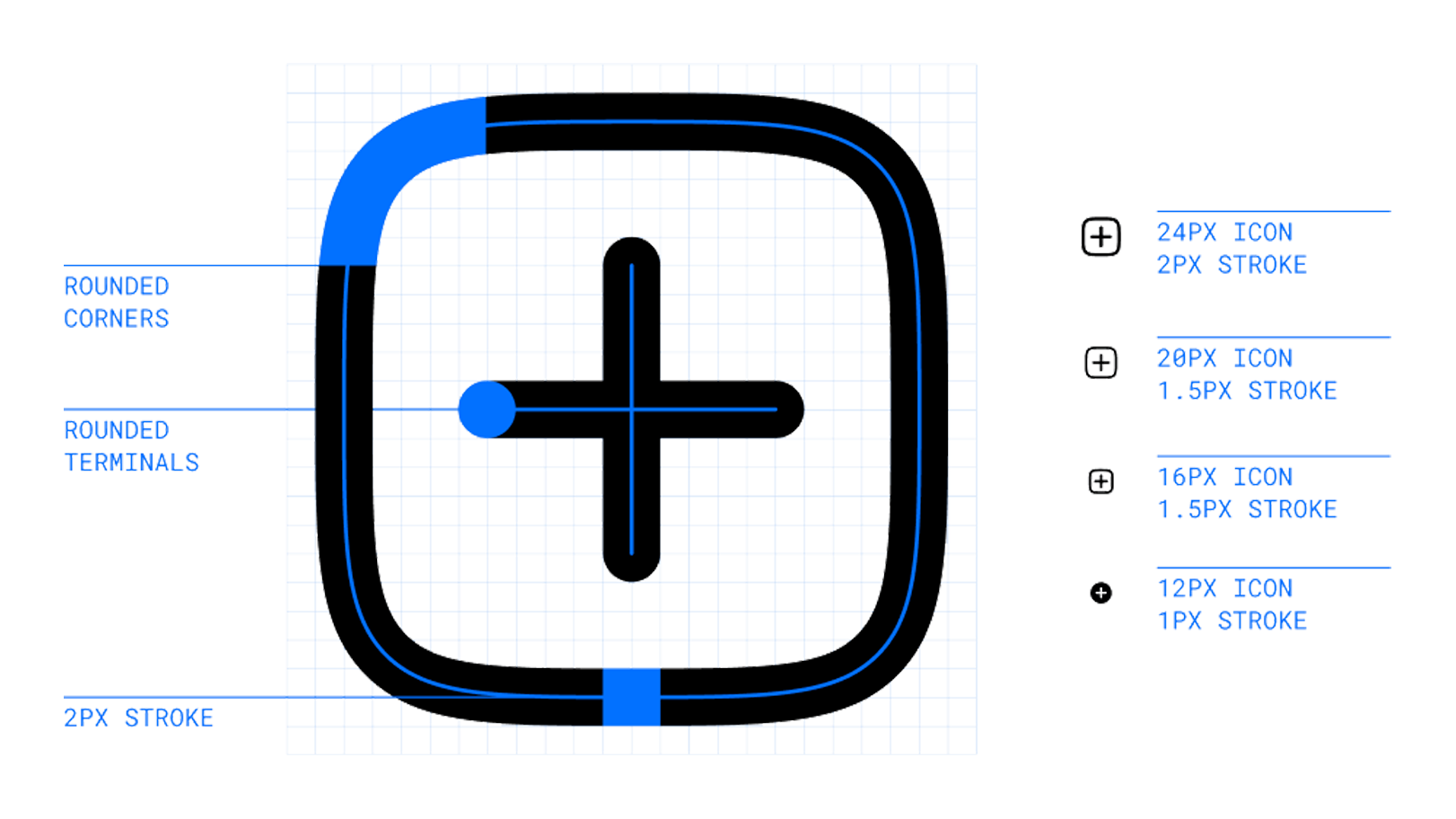
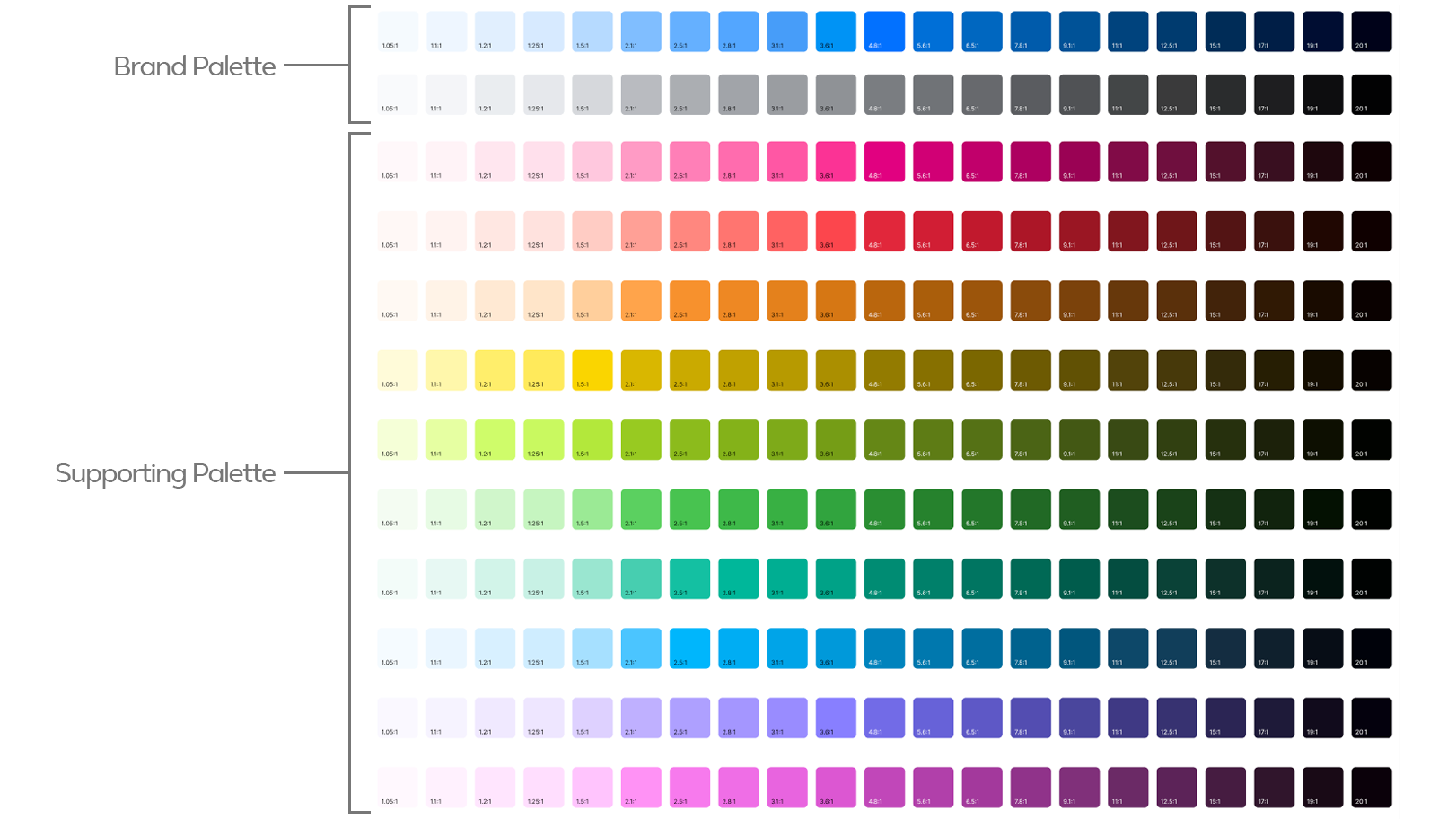
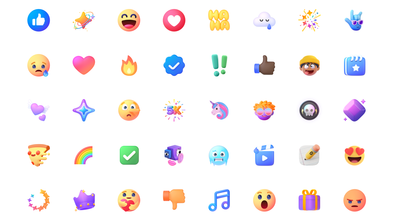
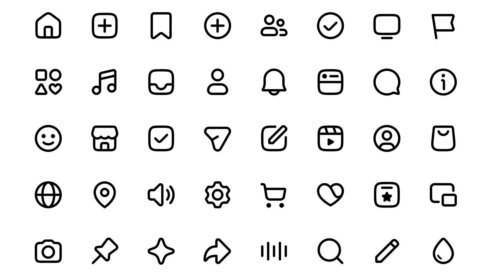
I led the redesign of Facebook’s visual design system, focusing on modernizing its most recognizable elements and translating them into a cohesive, extensible system used across both product and marketing. The work unified iconography, color, typography, layout, and accessibility standards into a single, shared foundation.
The result was a system that improved usability and accessibility across the product and established the foundation for how Facebook is designed, built, and marketed today, enabling teams to move faster at scale without sacrificing quality or brand clarity.
You can read more here: “Redefining Facebook’s Brand Identity”